Healthera
- 3 min read
my Role
- iOS and Android UI Design
timeline and progress
- July 2017 - present. Partially shipped.
team members
- Iris Gao (designer); Quintus Liu (PM); dev team
Background
Healthera is an UK based start-up, a provider of next-generation, pharmacy-integrated personal health management solutions. Healthera aims to bring pharmacies in the UK an all-rounded digital upgrade for top-notch patient-centered care, and to all of us who order and take medicines a free, simple and delightful medication management mobile app.
Process and goals
When we came in, Healthera already had a working app for iOS and Android. Because of the time and resource constraints on the development side, the stakeholders wanted the majority of the backend structure to remain unchanged.
Thus, our focus was on developing a consistent visual design language, as well as exploring new possibilities for interaction
As a result, our design process here was a bit different. Rather than conducting research, we used the existing data the company had on users, as well as their previous UI design, to consider how the interface might best be redesigned.
Some design decisions
Sign-up
Two-step sign up
The sign up process is broken down to two pages to avoid information overload.
Match with the nearest pharmacy
Once the user shares his/her location, we automatically add the nearest pharmacy to "My Pharmacy".
Homepage
Unified color system
The old design uses four different colors to represent the four major functions, which made the experience inconsistent. To replace the old design, we chose green as the primary color to be applied across the app.
Reminder info first
The most important funtion of the app is pill reminder. We put it on the top with a green background so that it gets the most attention.
My Pharmacy
List of pharmacy services
The homepage of "My Pharmacy" is a list of pharmacies that the user has joined. Services provided by the pharmacy are displayed so that the user can have a quick overview.
Quickly chat with the pharmacist
The Chat button provides a quick access to the pharmacist.
Pharmacy details with useful info
Tapping into a pharmacy will lead to the address, delivery and contact info under the Details tab.
Quickly chat with the pharmacist
The Chat button remains on the screen in case users prefer online chatting than phone calls.
My cabinet
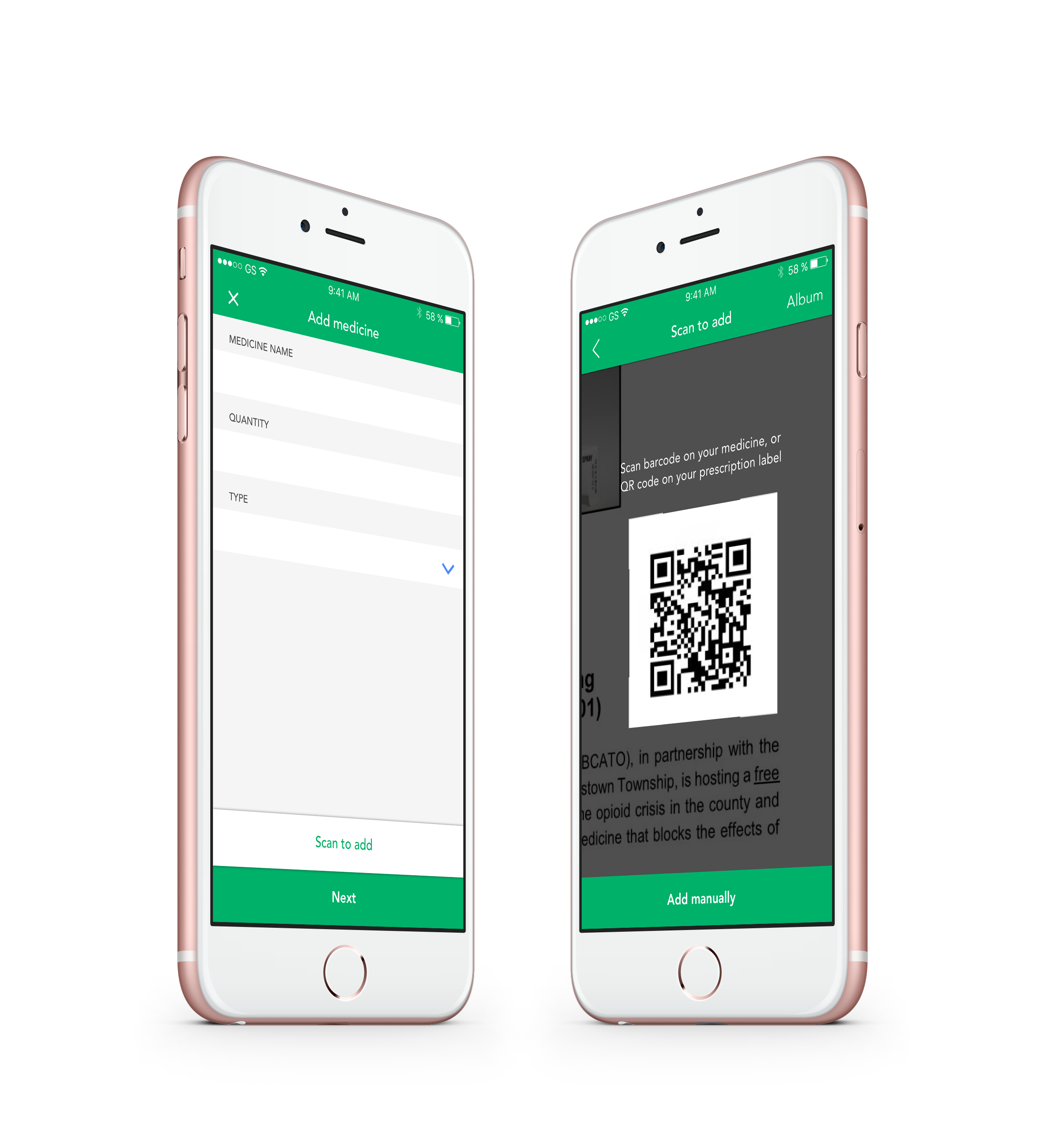
Scan or manually add medicines
Users can scan bar code or QR code on the medicine package to add a medicine. Information on dosage and quantity is automatically extracted.
Progress bar on medicine details page
A progress bar for the medicine informs the user how many days (s)he has left for this prescription.
Clear division of info and notes
The info on the medicine is in one page, while the notes taken by the user are on the other.