Samplify redesign
- 3 min read
my Role
- End-to-end Product Design
timeline and progress
- July 2019 - September 2019. Shipped.
team members
- Karla Lopez (PM); Dev team
What is Samplify?
Samplify is a platform that connects marketing researchers to millions of deeply profiled consumers across the world. Researchers use Samplify to collect survey responses and do further analysis based on the data.
Who uses Samplify?
1. Marketing Research Agencies (~70%)
2. In-house research teams at companies like Google and Verizon, etc. (~30%)
3. Individuals with a research need (0%, which is where we want to grow)
Why redesign?
1. Broken and outdated UI style
2. Lots of UX problems
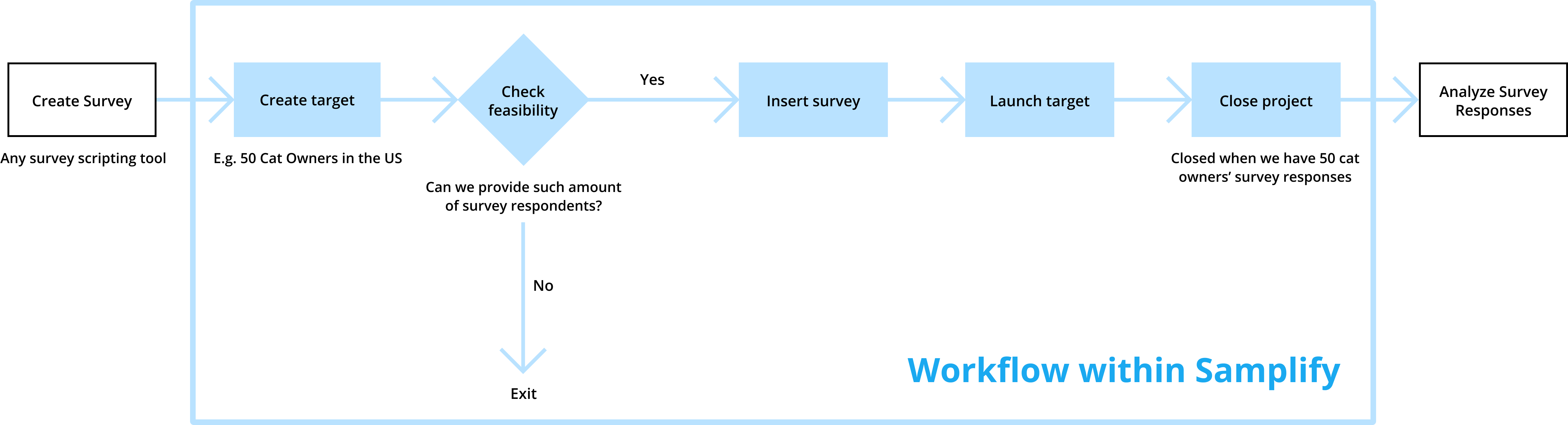
User flow for conducting a survey
While we wanted to do an overhaul of the product, we had to scope the project properly to make it feasible for the team. To do that, we first looked at the user flow.
Redesign goals
The team aligned on redesigning the first two steps of the flow and came up with two goals for this project:
1. Streamline the sampling (targeting) experience
2. Refresh and expand on the existing UI style to make it more scalable
A whole new targeting experience
1. Complete basic set-up of your target
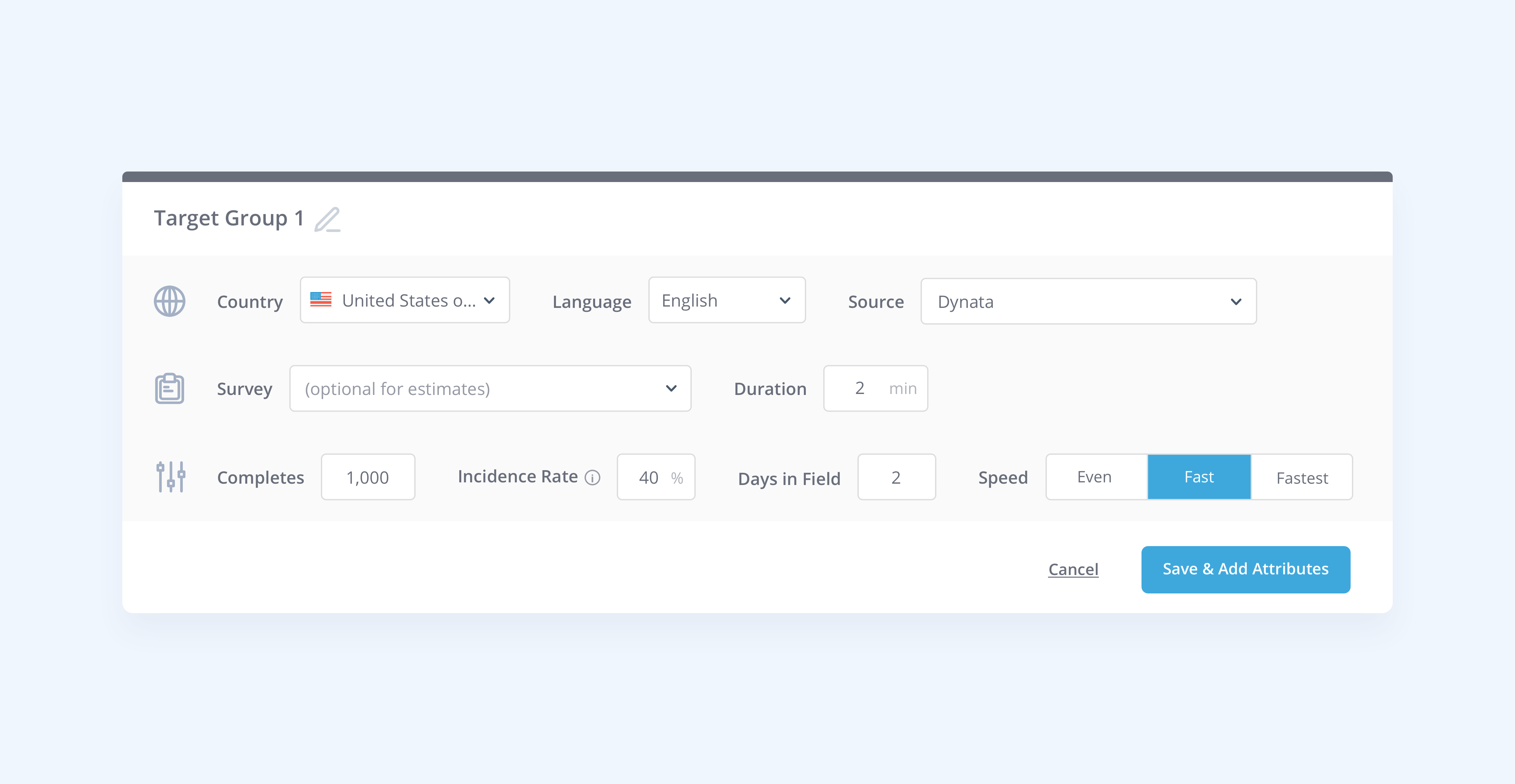
2. Add specific targeting attributes
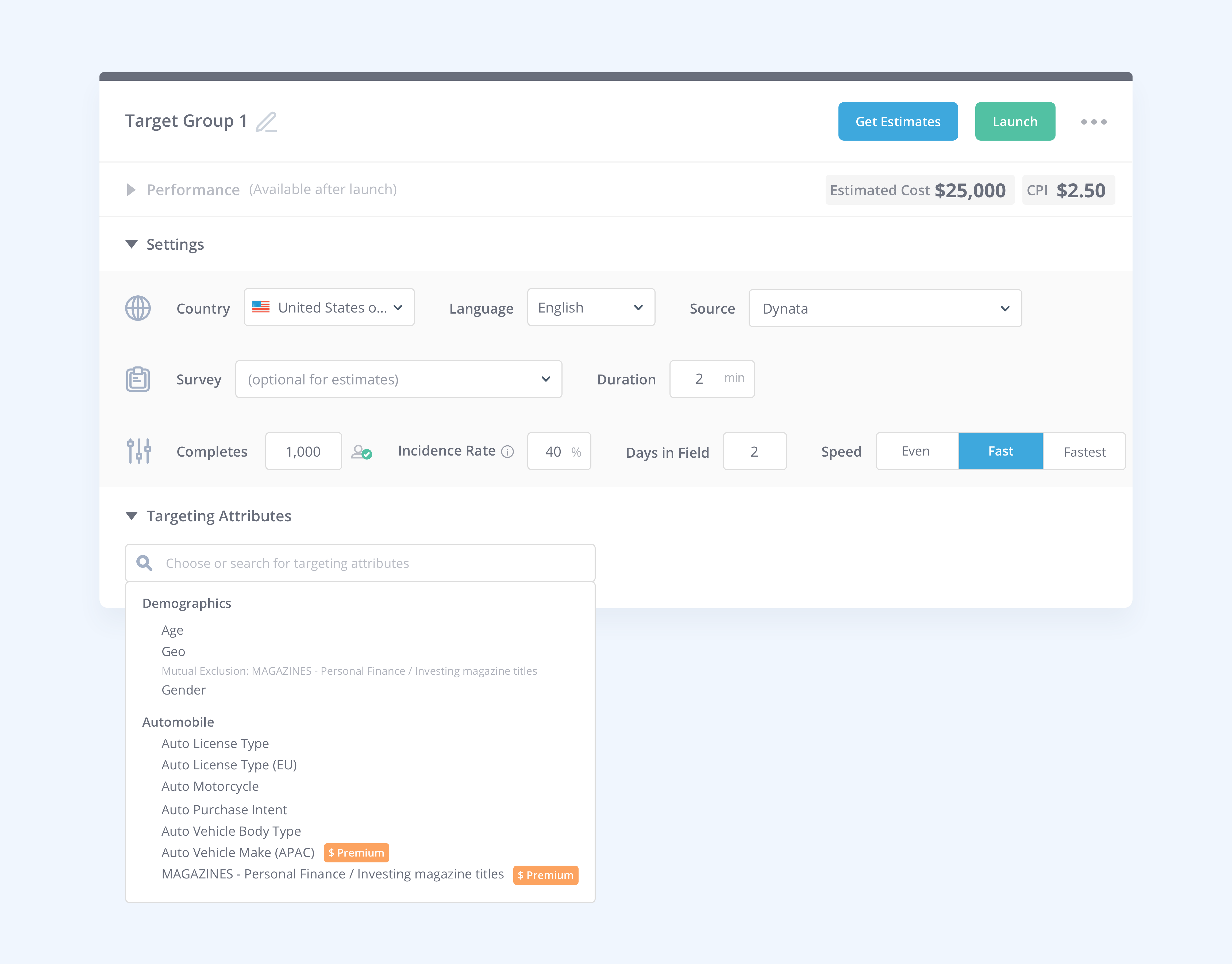
What is a targeting attribute?
Problems to be solved in the targeting experience
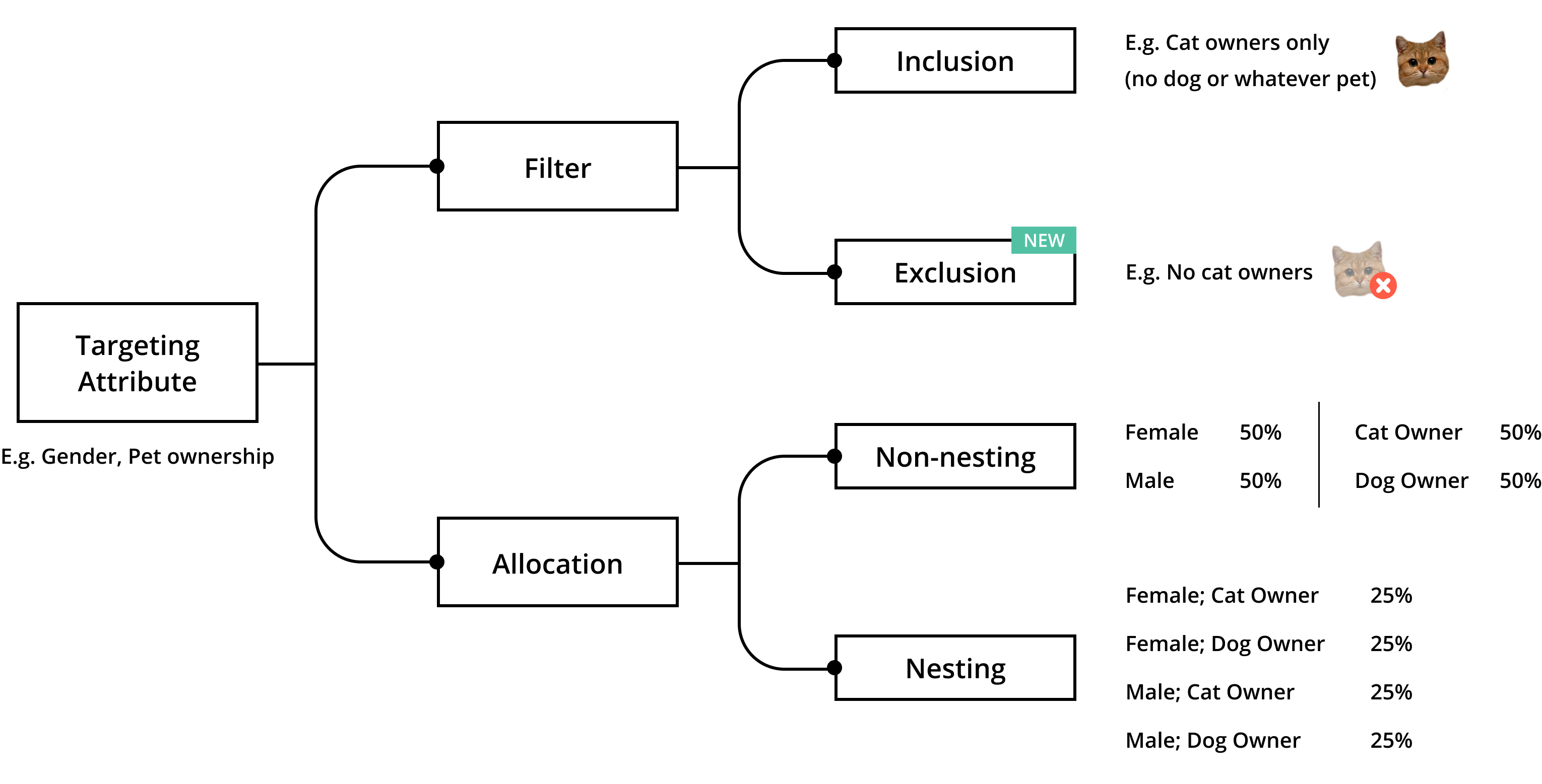
1. How might we help clients differentiate between filters and allocation?
In the old design, we often saw users turning on allocation when they intend to use a filter, with 100% of the completes allocated to a single filter option.
2. How might we design a UI that accomodates all the different directions an attribute can take?
Most attributes can be used as both filter and allocation. Among all the directions, nested allocation is the most complicated.
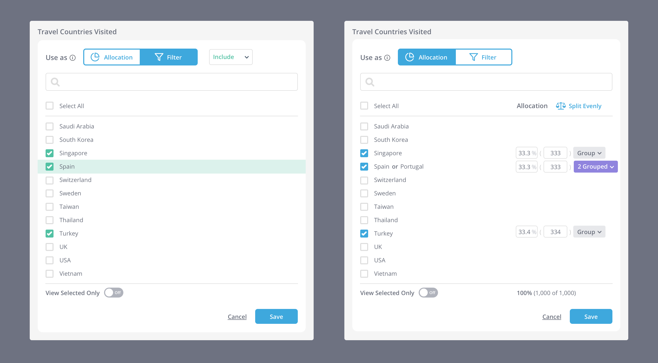
Filter vs. Allocation when editing attributes
Calling out the difference between the two; also offering allocation slots on the go.
Filter vs. Allocation post-editing
Using different layouts for filters and allocation to reduce confusion after editing is done.
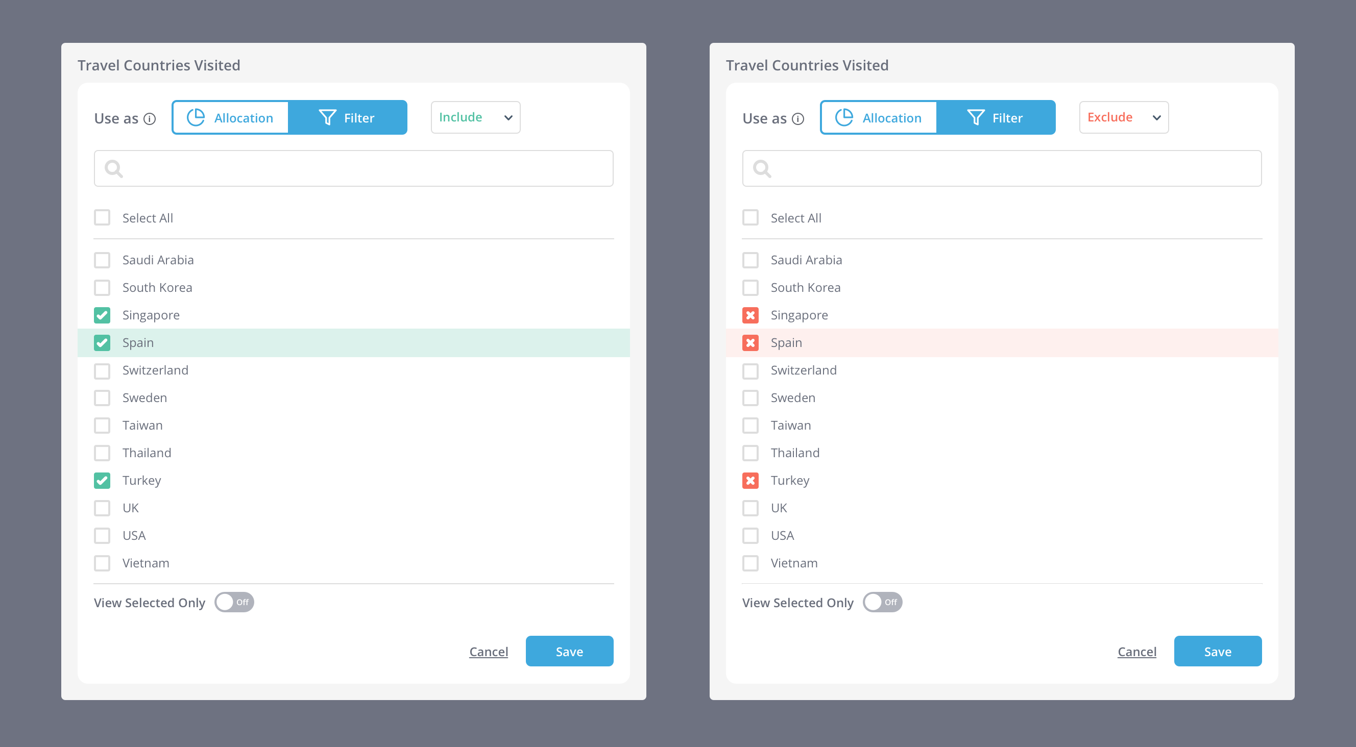
Include vs. Exclude
Using different affordances to visually communicate inclusion vs. exclusion.
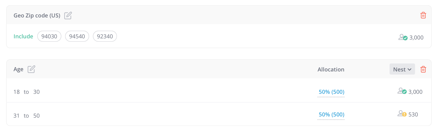
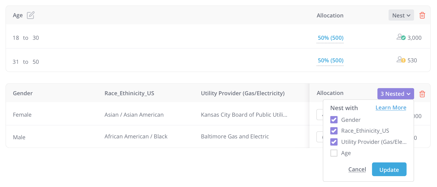
Nesting outside the modal
Unlike inclusion and exclusion, nesting happens outside the attribute editing modal, because the possible amount of nesting combination might be too complicated for our modal style.
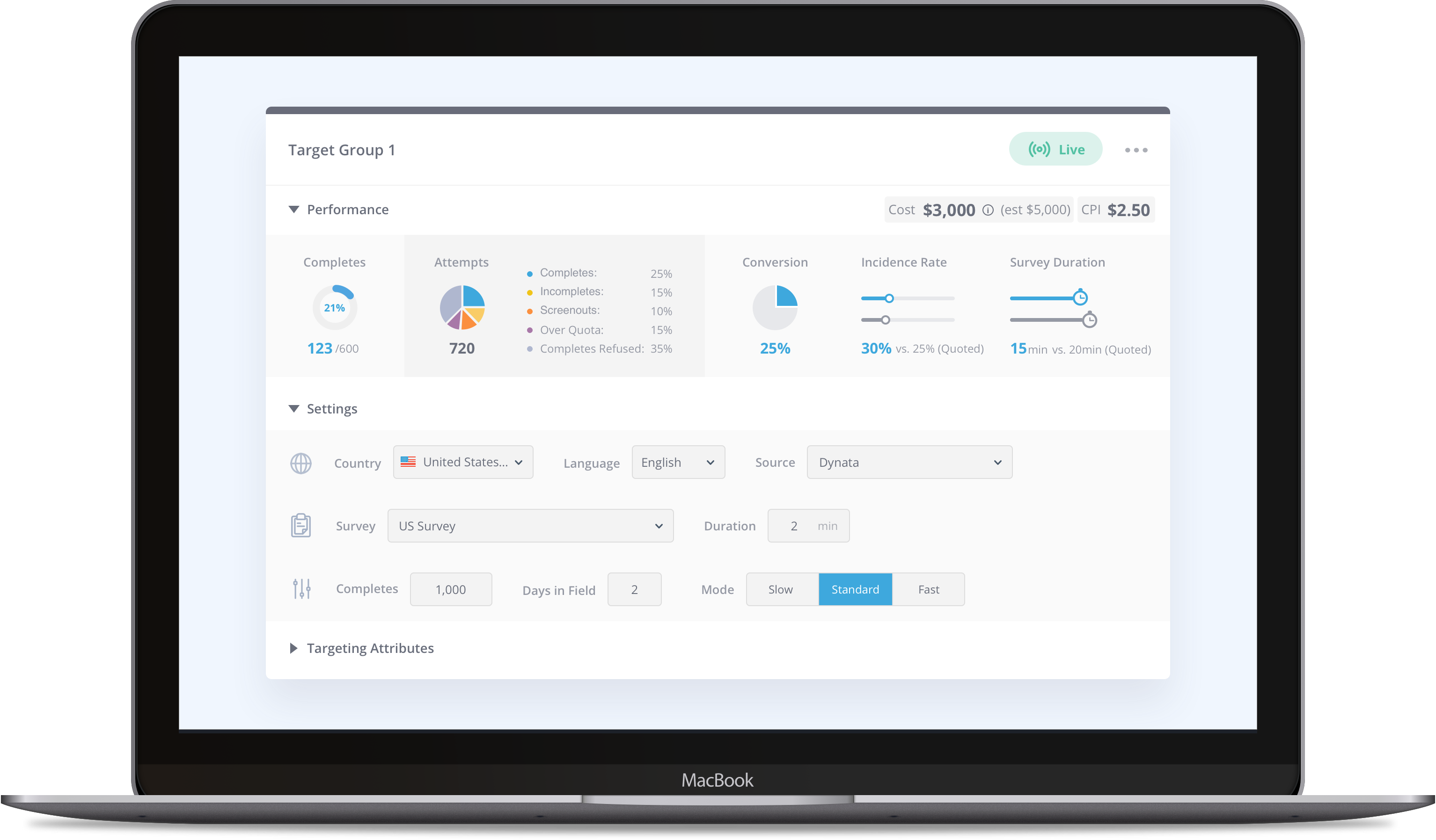
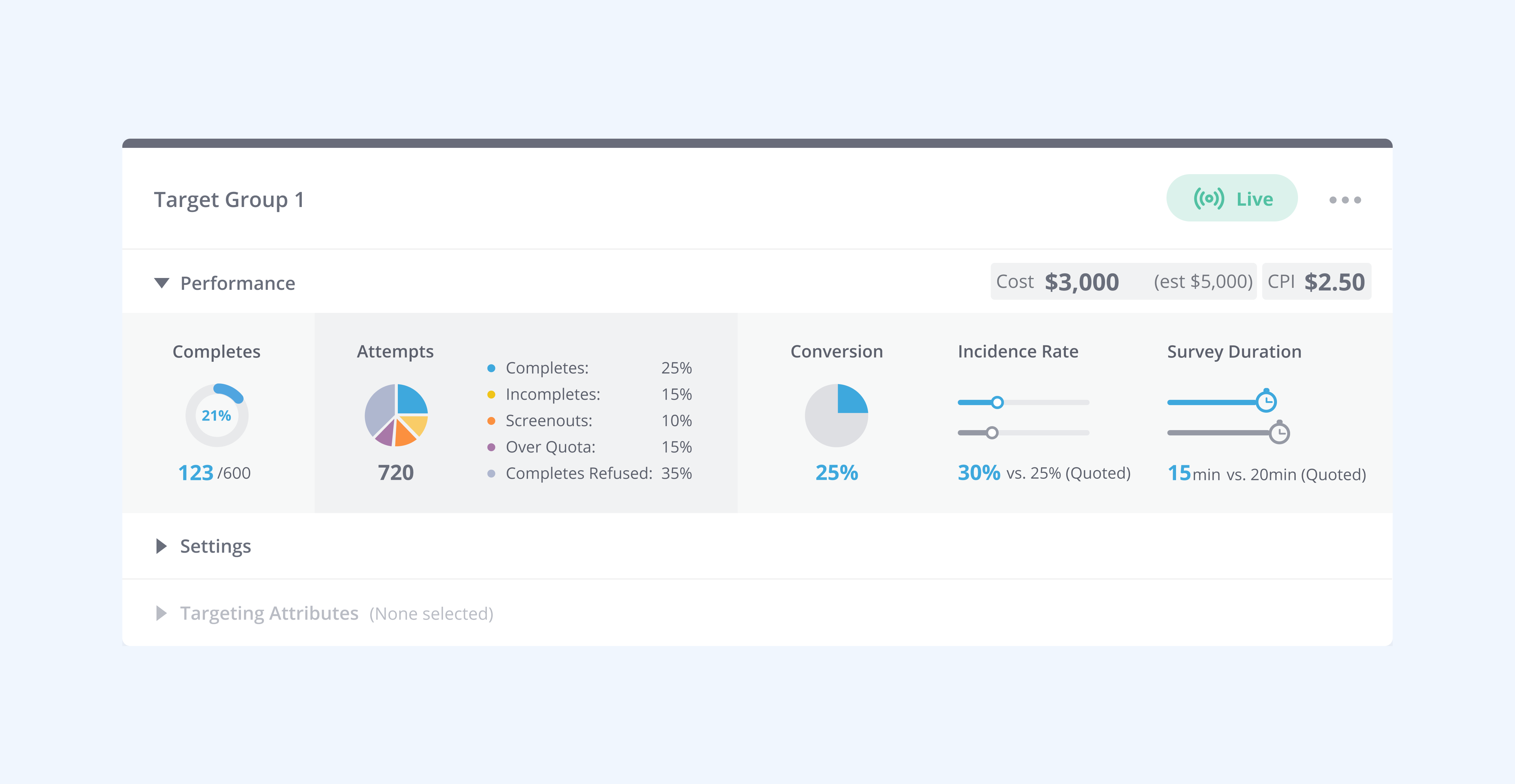
Data visualization for performance review
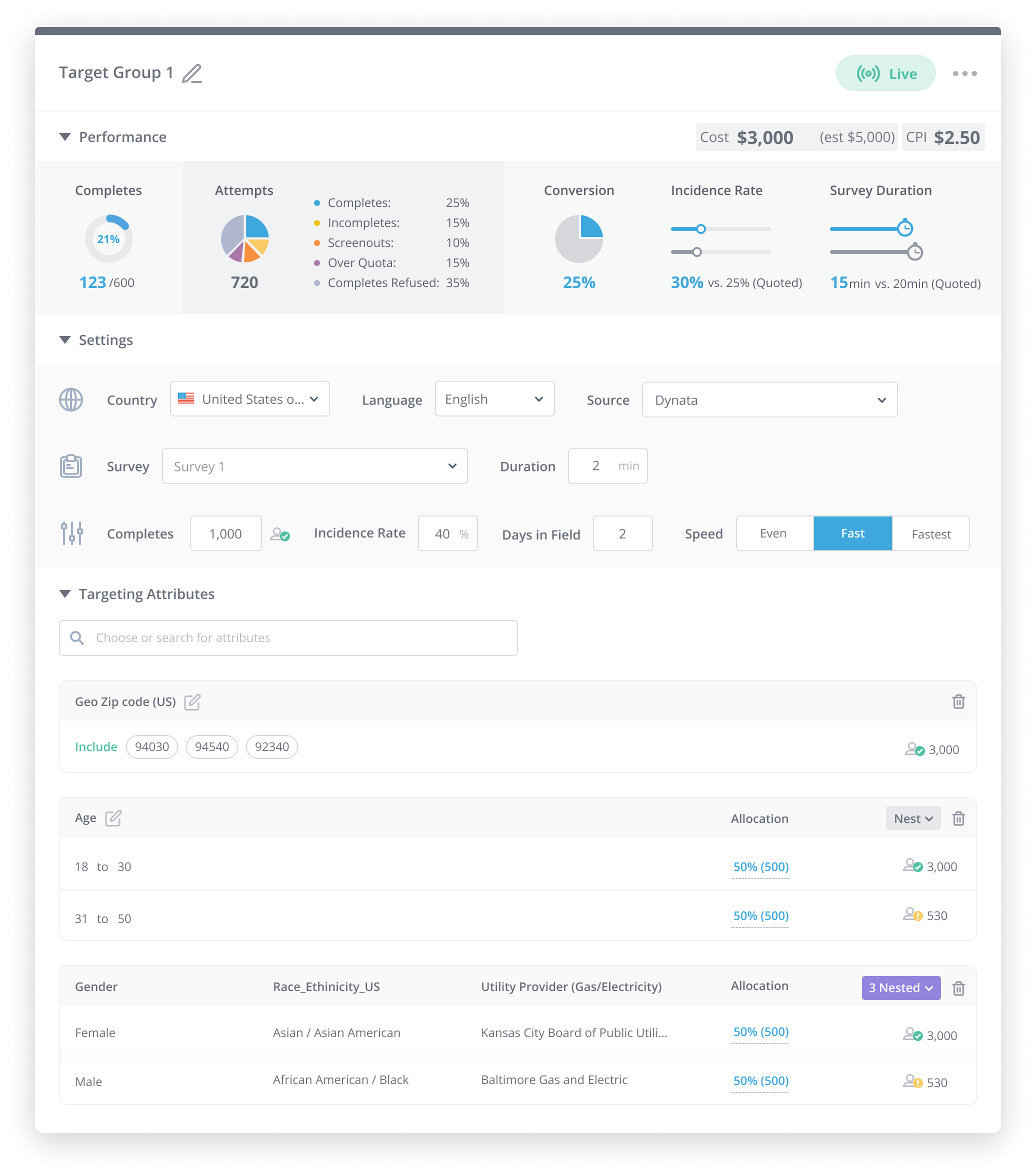
Piecing everything together
Key learnings
1) It's ok to ship incrementally.
We implemented the visual refresh first and then pushed out all the functional changes. It worked well because users can get used to a new interface that works no differently than the previous version, and then adapt quickly to any functional changes that we proposed. Since our first launch, we have heard almost none complaints or confusions about the redesign.
2) Combining quantitative and qualitative research is the key to good design.
In redesigning the experience, I relied on quantitative data on usage regarding certain functionalities, and also made good use of screen-recording products to see how actual users interact with our product. We also do frequent user interviews to get first-hand insights from our users. The combination worked like a magic in understanding user behaviors.