UpQuest
- 3 min read
my Role
- Product strategy ・ UX research & design ・ Logo design
Timeline
- October 2016 - December 2016
Team members
- Matt Chen & Tyler Berbert (UX research, wireframing & developing)
My ex-housemate at Stanford, Aileen, had just graduated and become an elementary school teacher. Three months into her first job, we talked. “It’s so hard!” said Aileen.“ I spent so much time trying to figure out what my students knew.”
Wondering if it is a common problem, my teammates and I went on to talk to four more K-12 teachers, all of whom teaching different years and subjects.
“I have too many students! I can’t pay enough attention to each of them.”
“My students have such different knowledge levels. What can I do? I teach to the middle.”
“Making and grading quizzes take so much time...”
“Existing quiz apps are clunky and complicated. I don’t have time for them.”
“Those test banks suck!”
Each of them has a bit of different angle of looking at the problems present in their teaching. Using these insights, we distilled a common denominator in the problems facing K-12 teachers:
The difficulty in tracking students’ knowledge levels and adjusting teaching plans accordingly
How does our solution work? What sets us apart from others?
1. Crowd-sourced quiz bank from the teaching community
2. Tags on all questions that allow detailed insights into students' knowledge levels
3. All your data in one place.
4. Super duper easy to use!
Let's walk through a teacher's journey on our app.
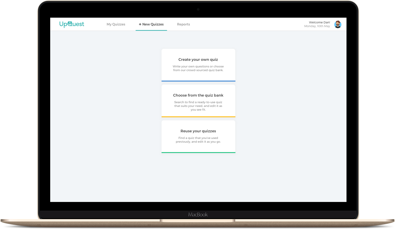
"+ New quizzes" tab
1. The teacher can create his/her own questions or copy and edit existing questions from our quiz bank, which includes questions from large test banks and quizzes made by our users.
2. (S)he can directly use quizzes from the bank. The questions came with tags that would later be used to systematically analyze the results.
3. (S)he can also use quizzes from his/her previous years.
All the questions come with tags on teaching standards like the Common Core, which will help us analyze the students' knowledge levels.
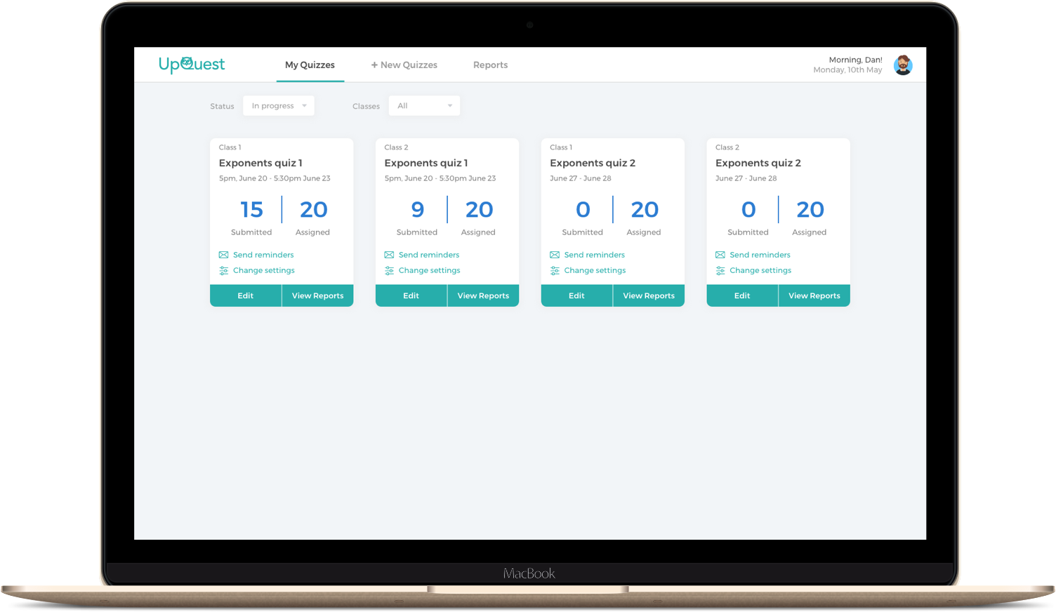
"My quizzes" tab
Once a quiz is created and assigned, it will show up in the "My quizzes" tab, which displays all the quizzes the teacher has made.
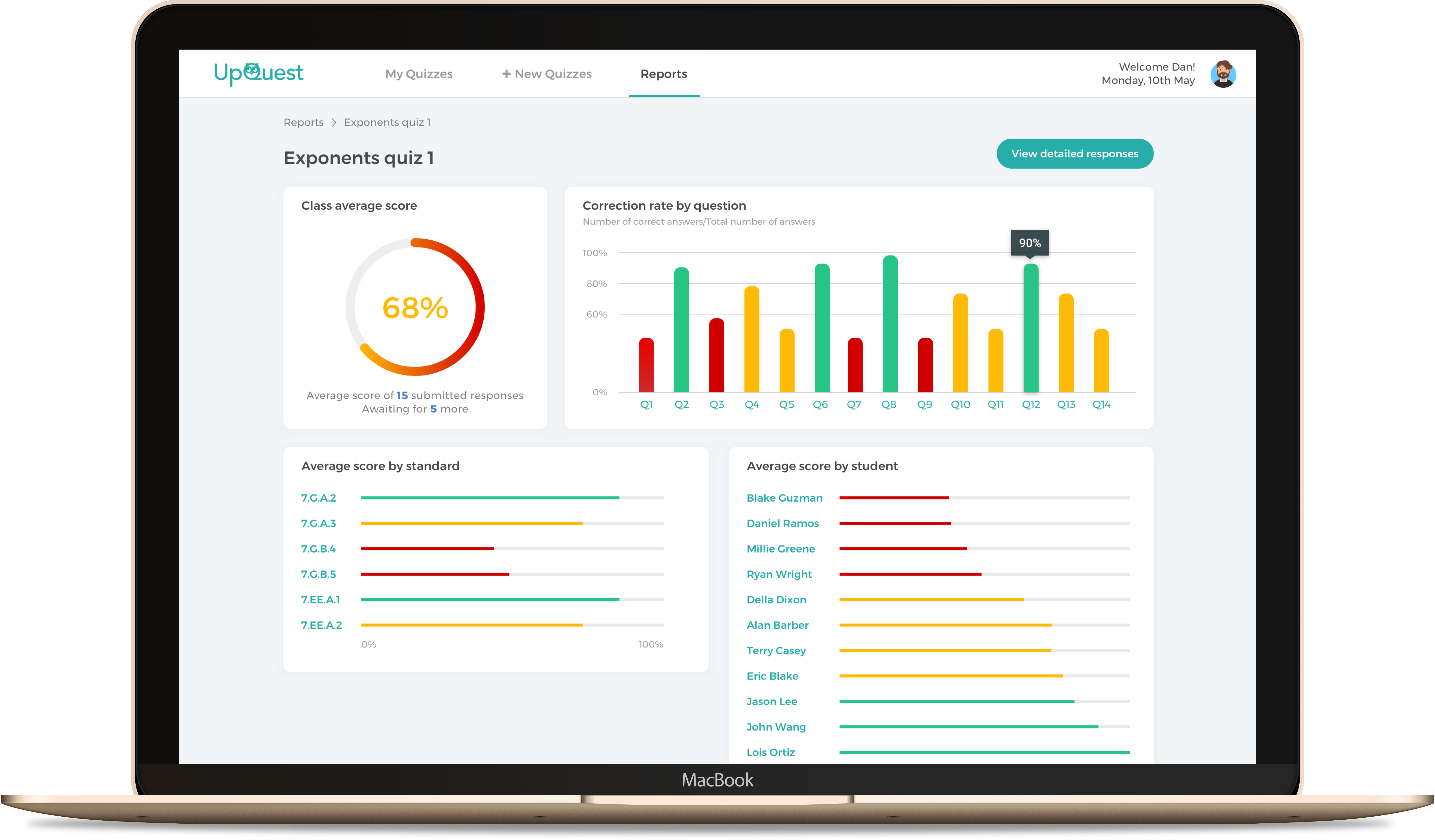
"Reports" tab. Unfortunately, Edna is falling behind.
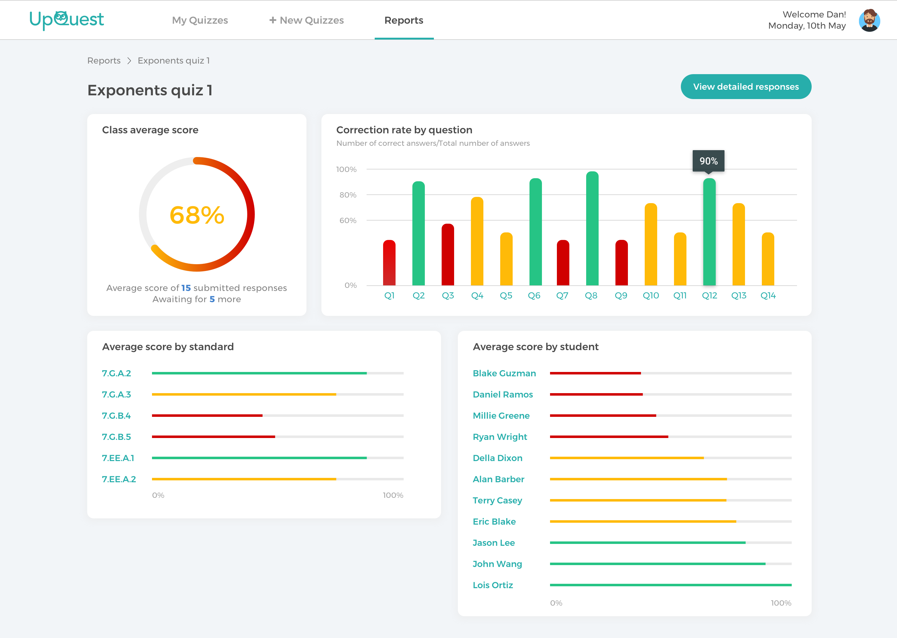
An overview of one quiz
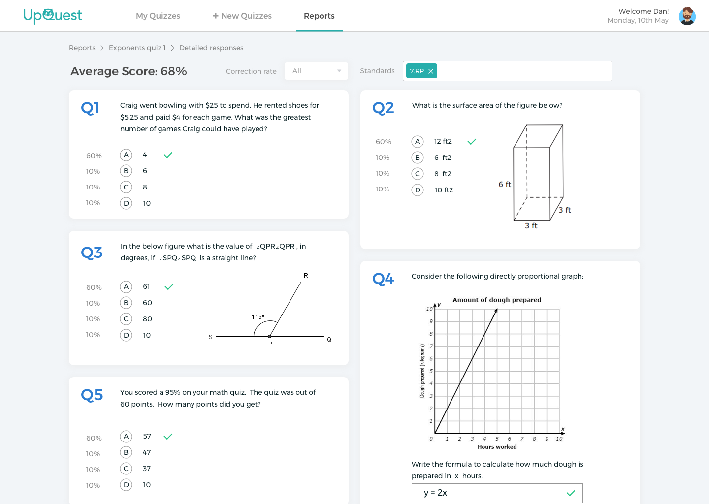
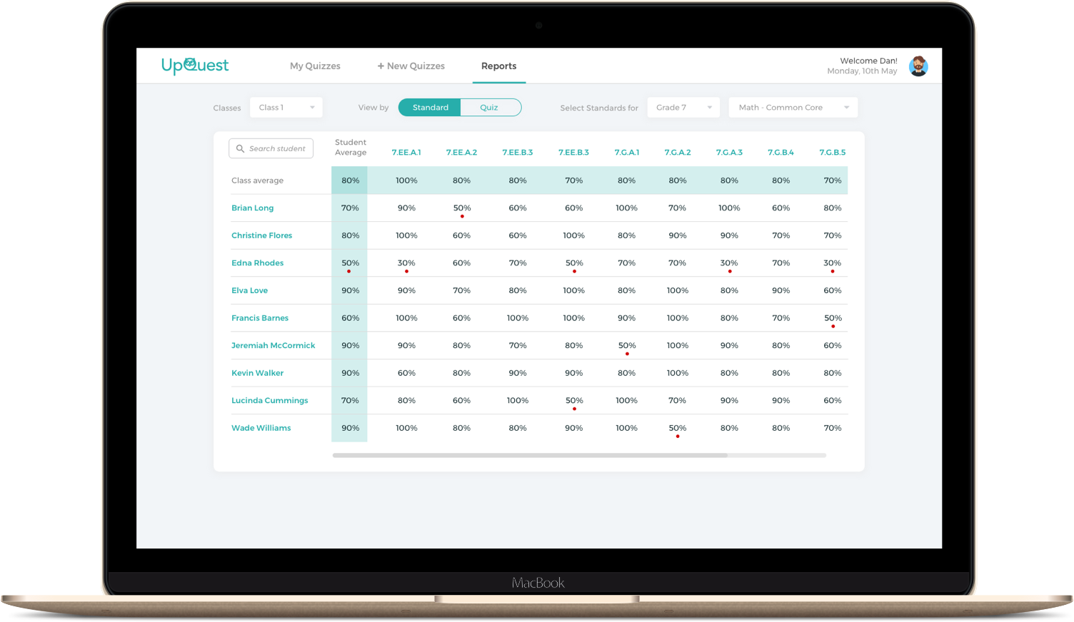
Detailed results page of one quiz
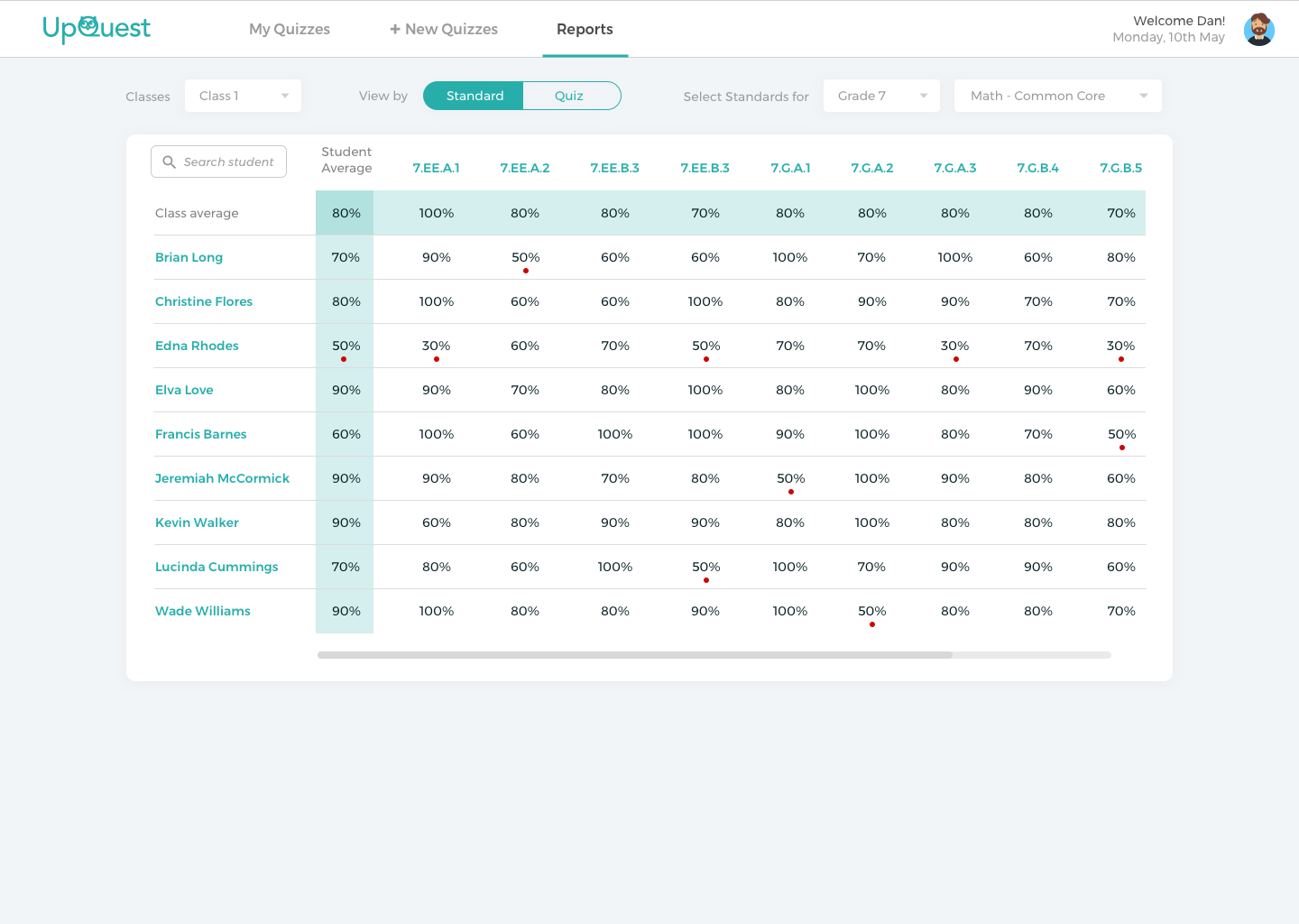
The teacher can go to the "Reports" tab and check the performance data of his/her students. The tags attached with the quiz questions would be analyzed and give him/her a granular understanding of her students' knowledge levels.
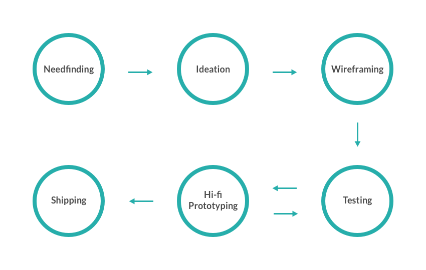
This was a project from an HCI class at Stanford. We followed the standard process religously. We started testing with users early on with a paper prototype, and then iterated through several rounds of tests. In the end, we shipped a product with front-end only, as requested by the class.
However, I wasn't very satisfied with the product that was shipped. Recently I've been working on a complete redesign of the project. Here in this case study, I'm showing the redesigned product.
Below I will focus on some major challenges we dealt with to show you how the design evolved through the process.
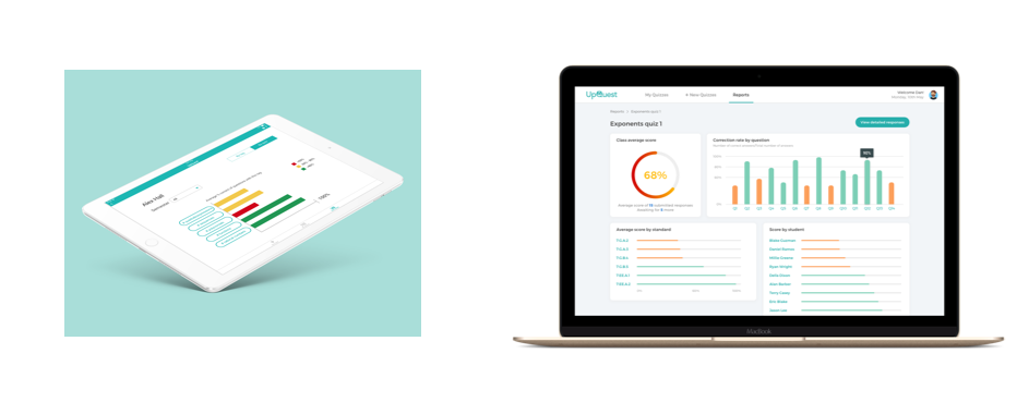
Since this was a class project, we had to fulfill the class requirement of making a mobile app. But now redesigning on my own, I think it's imperative that we switch to a web app, for two reasons:
1. Not every teacher has an iPad. A web app can be easily scaled down to a tablet size, but it doesn't work well the other way around.
2. Sometimes teachers might want to type their own questions. Typing on iPad is not a great experience yet.
Through competitor analysis, we found that one of the issues with existing quiz apps was that the navigation was often confusing. Two major qeustions are: 1) Where should teachers create quizzes from? A separate "Quiz bank" section or a button next to existing quizzes? 2) Should there be a "Students" section where teachers can check on individual students' data?
Throughout different phases, we tried out various ways to break down the navigation structure. The first three approaches we tried all put the creation and management of quizzes under one "Quizzes" section, which proved to be confusing during user tests. The first two approaches offered a separate "Students" section, which our testers found too similar to the "Reports" section.
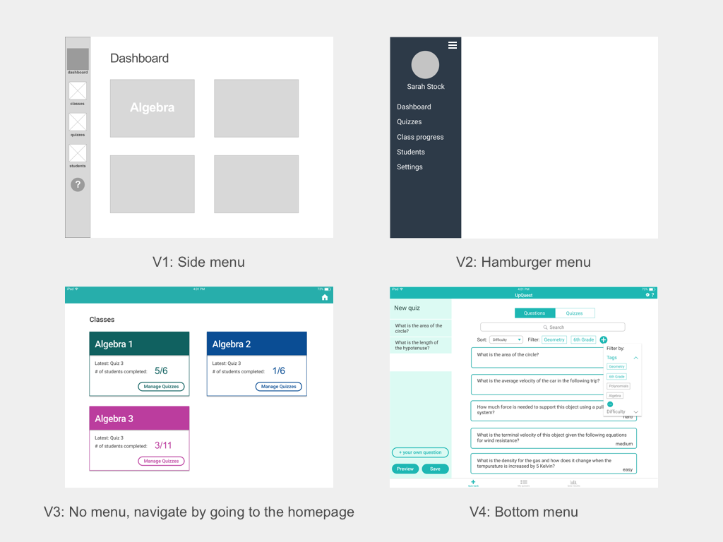
We settled down with a bottom navigation with three tabs that correspond with the three major user tasks: creating quizzes, managing existing quizzes, and checking out quiz results. To check on individual students, the teacher can go to the "Reports" section and search for names. This way the structure of the app became very clear.

With my redesign, the navigation is moved to the top following web standards. Profile sits at the top right corner.
So we decided all students data should go to one "Reports" section. How do we do data visualization for these pages?
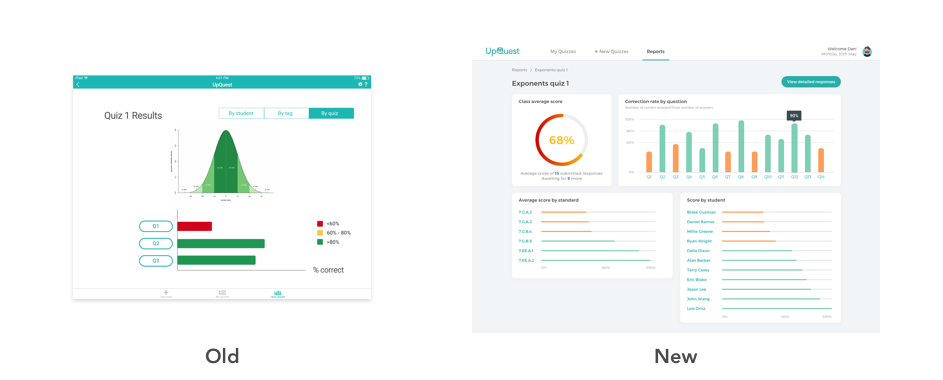
In the previous iPad version we put a normal distribution chart on the overview page of a quiz. But this was not something that everyone could easily understand. In the new version, all the important information that the teacher cares about are up there in different charts- Mean, mean by question, mean by teaching standard, and scores of each student.
When presenting quiz results, we used color coding to distinguish between right and wrong answers and among different performance levels. But one thing we had to consider was color blindness. Whenever we use green and red as distinguishers, we use other signs as an addition to the color code.
Instead of changing colors of the numbers or cubes themselves, we used additional dots to do the color coding.
My teammates trusted me with the responsibility of making the logo of the app. I set out with a goal to make a logo that has a cute and playful flavor, while keeping a professional feeling. The reason is that this app is for K-12 teachers, and it could use a little cuteness that makes teachers smile while tapping it (since looking at the quiz results isn't always fun).
I played around with the letters and decided to change the letter Q into an owl, because it is the symbol of wisdom, which fits the educational nature of our app. The owl is looking upward, which gives off a curious look and conveys the ideas of "up" and "question". This was also where we got our name. I chose Avenir as the typeface as it has the most rounded/cute Q (not counting Comic Sans), and I manually adjusted all the ends of the strokes to make them look rounded, in tandem with the cute owl.